Why Are Orange and Blue the Standard Warehouse Rack Colors?

Time:2026-09-07 Author:Henry
0%

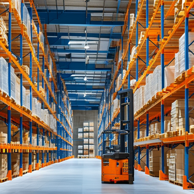
Walk through a modern distribution center, and orange uprights often frame blue beams above concrete floors. This color pairing is familiar, but it is not a universal engineering rule. So, why are orange and blue the standard warehouse rack colors? The answer combines visibility, manufacturing traditions, inspection habits, and visual communication.

Orange uprights create strong contrast against gray floors, steel structures, and warehouse lighting. That contrast can help workers notice rack damage, especially near forklift travel lanes. Blue beams provide a recognizable horizontal pattern. They also support quick visual checks across long aisles. However, color alone cannot prevent collisions or rack failure. OSHA’s material-handling requirements, including 29 CFR 1910.176, emphasize safe storage and clear aisles, not a mandatory paint scheme. ANSI MH16.1 focuses on steel pallet-rack design and performance. It does not require orange and blue finishes.

Industry evidence adds useful context. MHI’s 2024 Annual Industry Report describes continuing investment in warehouse automation, labor productivity, and supply-chain visibility. These priorities increase the value of clear, consistent visual standards. Rack colors can support that consistency, but they remain secondary controls. Load plaques, guarding, inspections, training, and engineered layouts matter more.

The explanation is not perfectly tidy. Some suppliers use orange and blue because customers recognize them. Others select custom colors for branding, corrosion protection, or facility zoning. In practice, a scratched orange upright beside a bent blue beam tells a more important story than color preference. This article examines the history, safety logic, market influence, and practical limits behind the familiar warehouse rack palette.
Why Are Orange and Blue the Standard Warehouse Rack Colors?

How Orange-and-Blue Racks Became a Warehouse Visual Convention

Orange-and-blue warehouse racks became a visual convention through repeated operational choices, not one universal rule. Orange usually marks upright frames, guards, or impact-prone edges. Blue often identifies beams and stored load levels. The contrast is immediate under high-bay lighting. A picker can distinguish structure from inventory before stepping closer.

This habit also fits modern warehouse pressures. The 2024 MHI Annual Industry Report projects robotics and automation adoption to reach 45% within two years. More equipment means more movement, intersections, and visual decisions. Consistent rack colors help workers recognize fixed boundaries beside moving vehicles. They support wayfinding, inspection, and damage reporting. They do not replace training or engineered protection. Color alone is weak.

The convention is practical, but not perfectly standardized. ANSI/ISEA Z535.1 provides safety-color guidance, while individual facilities still choose their own rack palettes. The U.S. Bureau of Labor Statistics recorded 5,283 fatal occupational injuries in 2023, with transportation and material-moving work remaining a major exposure area. That figure does not prove rack colors prevent injuries. It does show why small visual cues deserve careful design. A damaged orange upright may blend into a busy aisle. Blue beams can disappear behind dark cartons. I have seen clean color systems fail when lighting, labels, and floor markings disagree. Good warehouse design treats color as one layer within a larger visual language.

OSHA 1910.144: Yellow Marks Hazards, Not Standard Rack Components

Why Are Orange and Blue the Standard Warehouse Rack Colors?

Orange beams and blue uprights are common in warehouses because they create strong visual contrast. Orange catches attention near forklift travel paths, while blue gives vertical frames a consistent structural identity. However, these colors are industry conventions, not universal OSHA requirements. Rack manufacturers and facility managers often choose them for visibility, cost, and easier inspection.

OSHA 1910.144 places yellow in a different role. Yellow identifies physical hazards and caution areas, such as exposed edges, low clearances, moving equipment zones, and tripping risks. It does not require every rack component to be yellow. This distinction matters. A yellow rack beam may visually compete with hazard markings and weaken the warning system. OSHA’s powered industrial truck guidance reports about 85 forklift-related fatalities and 34,900 serious injuries each year. Clear visual signals can support safer decisions, but paint cannot replace training, inspections, or sound rack design.

Tips: Keep hazard yellow limited to genuine caution points. Mark damaged uprights immediately, even when damage looks minor. Compare colors under warehouse lighting, not only in bright showrooms. A tidy color plan can still hide poor housekeeping. We sometimes overestimate what visibility alone can solve. Use documented inspections, readable load limits, and controlled forklift routes.

References: OSHA 1910.144, OSHA Powered Industrial Trucks safety guidance, and ANSI/RMI rack design guidance.

ANSI Z535.1 Explains Why High-Contrast Rack Colors Improve Recognition

Orange and blue are common warehouse rack colors because they create a strong visual contrast. Orange attracts attention quickly, while blue provides a darker, stable background. This combination helps workers recognize rack frames, beams, and loading zones from a distance. ANSI Z535.1 provides guidance on safety colors and their meanings. However, it does not require every warehouse rack to use orange and blue.

Contrast matters most in busy aisles. Under bright lights, orange edges remain easy to notice. Blue components can separate structural parts from stored cartons, pallets, and floor markings. This visual separation supports faster recognition during picking, replenishment, and equipment movement. It also helps visitors understand where rack boundaries begin. Clear visibility reduces hesitation. Small delays can matter.

Practical experience shows that color alone is not enough. Dust, faded paint, shadows, and damaged coatings can weaken the original contrast. We once treated color as a permanent safety feature. That assumption was wrong. Rack inspections should check visibility as carefully as bent frames or loose anchors. Lighting, aisle width, warning signs, and worker training still influence safe behavior. Blue may also appear less distinct in dark areas, so each facility should test sample colors under actual operating conditions. A visually attractive scheme is not automatically an effective one.

Why Are Orange and Blue the Standard Warehouse Rack Colors?

ANSI Z535.1 defines safety-color conventions, while high-contrast color combinations help workers recognize equipment and hazards more quickly. The chart compares the calculated contrast ratio of representative safety colors against a white background.

Higher contrast ratios generally improve visual differentiation. Values are calculated from the displayed sRGB color samples using the relative-luminance contrast-ratio formula; ANSI Z535.1 does not mandate a specific color for warehouse racks.

RMI ANSI MH16.1 Load Standards Put Safety Beyond Paint Color

Orange and blue warehouse racks are common because they improve visibility. Bright beams stand out against concrete floors and dark storage areas. Color also helps workers recognize rack levels and report damaged components quickly. Yet paint is not a load rating. It cannot confirm whether a rack will safely support a pallet.

RMI ANSI MH16.1 focuses on structural performance, design assumptions, and rated capacity. The standard considers upright frames, beams, connections, bracing, loads, and installation conditions. A capacity plaque should match the actual configuration, including beam spacing and pallet placement. Small changes matter. A heavier pallet, altered frame spacing, or missing anchor can change the risk.

Look beyond the finish.

In field inspections, I have seen clean-looking orange beams supporting poorly positioned loads. I have also seen faded blue frames performing properly after documented repairs. That contrast is easy to overlook. Workers need practical training, clear load data, and regular inspections by competent personnel. Damage should be isolated and assessed, not hidden with fresh paint. Standards guide safer decisions, but they do not replace engineering judgment or disciplined daily use. Paint helps people see the system. The structure and its verified capacity determine what it can carry.

Orange Beams and Blue Frames: Visibility, Branding, and Component Coding

Orange beams and blue frames are common because they create a quick visual hierarchy. The beam carries the load, so its bright orange face attracts attention during picking and inspections. The upright frame stays blue, helping workers recognize the rack structure behind stored cartons. This contrast also supports component coding. Damaged beams, frame posts, guards, and braces become easier to distinguish from a distance.

Visibility is not merely aesthetic. The U.S. Bureau of Labor Statistics reported 4.8 recordable cases per 100 full-time workers in transportation and warehousing during 2023. That figure does not prove rack color prevents injuries. It does show why small visual controls deserve careful attention. ANSI/ASSP Z535.1 also treats color as part of a broader safety communication system, not a substitute for signs, training, or inspections. In practical audits, orange edges are easier to notice near forklift travel lanes. Dust can weaken that advantage.

Blue frames can also support branding and inventory logic without displaying a company name. A facility may assign blue to standard storage, gray to returns, or another color to restricted equipment. Consistency matters more than fashion. However, color coding can fail when lighting changes, paint fades, or workers have color-vision limitations. That weakness is easy to overlook. Labels, location codes, reflective markings, and routine damage checks should reinforce the colors. The best scheme is visible, documented, and slightly boring. Safety systems usually work better that way.

Why Are Orange and Blue the Standard Warehouse Rack Colors? - Orange Beams and Blue Frames: Visibility, Branding, and Component Coding

Dimension Orange Beams Blue Frames Practical Warehouse Value
Visual contrast Bright warm color that stands out against pallets, cartons, concrete, and neutral warehouse interiors. Dark, cool color that creates a clear outline around the upright structure. The two-color combination helps workers distinguish horizontal load beams from vertical support frames at a glance.
Component identification Commonly used to identify load-carrying beams and beam elevations. Commonly used to identify uprights, columns, and the vertical rack line. Supports faster communication when reporting damaged, missing, or incorrectly positioned components.
Operational visibility High visibility can make beam locations easier to see from warehouse aisles and equipment operating areas. The darker frame provides a stable visual reference for rack boundaries and bay alignment. Color contrast may support orientation, but it does not replace traffic controls, lighting, training, or safety procedures.
Damage awareness Visible scratches, bends, paint loss, or deformation can be easier to notice on a bright painted surface. Damage to upright columns, base plates, and bracing can be visually separated from surrounding equipment. Clear visibility can support routine inspections and prompt reporting, while formal inspection criteria remain essential.
Color coding Often functions as a visual code for horizontal members, but the exact meaning depends on the facility’s specification. Often functions as a visual code for vertical members and rack support structure. A documented site legend is needed because rack colors are not a universal engineering code.
Branding and appearance Creates a strong accent color that can make the storage system visually recognizable. Provides a professional, consistent structural background for the rack layout. A consistent palette can reinforce facility identity without changing the rack’s structural function.
Coating and maintenance Usually protected with an industrial coating selected for abrasion resistance and warehouse conditions. Usually receives the same type of protective coating, with color selected according to the project specification. Color alone does not prevent corrosion or damage; cleaning, inspection, repair, and environmental control are still required.
Safety communication Can improve visual recognition of rack members in a busy operating environment. Helps define the fixed structural zone around storage positions. Paint colors are supplementary visual aids and should not be interpreted as a substitute for regulated safety markings.
Important limitation Orange does not inherently indicate a specific load capacity, inspection status, or compliance level. Blue does not inherently indicate a specific rack type, manufacturer, or allowable storage height. Rack capacity, compatibility, and safety must be verified through engineering documentation, load plaques, inspections, and applicable local requirements.

Note: Orange beams and blue frames are common design choices, not universal industry requirements. Actual rack colors and component meanings vary by facility, specification, coating system, and regional practice.

FAQS

: Why are orange and blue rack colors common in warehouses?

: Their strong contrast helps workers recognize rack structures quickly under high-bay lighting. The colors are practical, not universal.

What does orange usually identify?

Orange often marks upright frames, guards, or edges exposed to equipment impacts. It draws attention near vehicle routes.

What does blue usually identify?

Blue often marks beams, stored load levels, or stable structural sections. Some facilities use the colors differently.

Are orange and blue legally required for warehouse racks?

No. They are common visual conventions, not universal legal requirements. Facilities choose palettes based on visibility, cost, and inspection needs.

Why does color contrast matter in busy aisles?

Workers can separate fixed rack boundaries from cartons, pallets, and moving equipment. Recognition becomes faster. That helps, but only slightly.

Should yellow be used for every rack component?

No. Yellow is better reserved for genuine hazards, caution zones, exposed edges, and low clearances. Too much yellow can weaken warning signals.

Can rack color replace training and inspections?

No. Paint cannot correct poor housekeeping, damaged frames, weak lighting, or unsafe vehicle routes. Color alone is weak.

What can reduce the visibility of rack colors?

Dust, shadows, faded coatings, dark cartons, and conflicting floor markings can hide the original contrast. A clean showroom test proves little.

How should a facility test its rack color system?

Check sample colors under actual lighting, aisle conditions, and normal storage loads. Inspect visibility with the same attention given to bent frames and loose anchors.

What is an easy mistake when using visual color systems?

Managers may assume bright paint solves deeper safety problems. I have made that assumption too. It was wrong.

Conclusion

The question “why are orange and blue the standard warehouse rack colors” is best answered through a combination of visual communication, workplace organization, and practical design. Orange beams stand out against typical warehouse backgrounds, making load levels and rack components easier to recognize, while blue frames create a clear structural outline. Over time, this contrast became a familiar visual convention that helps workers identify storage systems quickly and supports consistent component coding. The colors may also reinforce a facility’s visual identity without replacing safety procedures.

Color alone, however, does not determine whether a rack system is safe. OSHA 1910.144 primarily uses yellow to identify hazards and caution areas, rather than requiring standard rack components to be orange or blue. ANSI Z535.1 explains how high-contrast colors improve recognition, while RMI ANSI MH16.1 focuses on engineering, load capacity, installation, and performance requirements. In practice, orange-and-blue racks combine visibility and organization, but safe operation depends on proper design, inspection, loading, and training—not paint color alone.

Henry

Henry

Henry is a dedicated marketing professional with a profound expertise in the company's offerings. With years of experience in the industry, he possesses an impressive understanding of the market dynamics and consumer behaviors that drive success. Henry is committed to sharing his insights through......